presented by Karim, Alex, Benjamin, Eileen
“…we must remember that these [children] are to become citizens of Canada, and the fathers and mothers of Canadians.” AT Freed, May 30, 1910 (The Hamilton Spectator)
Between 1869 and 1948 over 100,000 children immigrated to Canada from the United Kingdom (Johnson). Many records exist that document the names of the children that travelled and in which years to various locations in Canada. Our group examined the compiled data to see if any trends might be revealed. In the process, we tried to collect clues about some of the individuals from the brief comments from which we could infer more about the people themselves.
Introduction
Have you ever looked at a spreadsheet and wondered about the individual data points? Or wondered about your own connection to the data? Spreadsheets are wonderful tools for aggregating data but something is lost when people are represented by data points. We wanted to retransform a stark spreadsheet into something more visual that could allow someone to interact with the data in a more personal way. It is estimated that roughly one in ten Canadians is descended from one of the Home Children (Johnson), so there is a chance that one of your relatives is reflected in the data that we examined.
Our group was excited by the possibility of representing the Home Children migration data on a map. Initially we wanted to plot migrations by departure and destination with cross-reference to mortality rates. We hoped to overlay the immigration in various layers and then search for trends in the data, for example perhaps patterns that might emerge showing that some destinations were more favourable than others. Unfortunately the available data did not provide enough details to try this approach. We then trialed a plan to plot the final known destination of the home children, colour-coded by decade, onto layers on a Google map. We hoped this would allow us to learn if there were any trends in migration over the years, for example a general westward expansion over time as rail infrastructure expanded. We imagined that we could show the flows of migration and even spotlight selected individuals when certain areas were selected. However, limitations of Google maps layer densities meant that this was not possible.
Left, an anonymous Torontonian complains about “imported waifs” taking jobs from Canadian Children (via newspapers.com). Above, girls from one of Dr Barnardo’s homes (via LAC, CC licence). Below, boy plowing at Dr Barnardo’s Industrial farm (via LAC, CC licence). Click to view larger images.
Data Handling
We began with the Home Children – July 2023 Data set that aggregated a variety of other source material in an attempt to represent a large number of immigrant Home Children. Alex and Benjamin used Open Refine to initially clean the data. We wanted to simplify the data set to show the year and destination city of each child. This was complex because of the variety of ways in which destinations were represented (see the Varia section for some examples). After many hours of work via Open Refine, a partially prepared data set was further edited using the sort and filter function of Excel. Karim’s experience with excel data handling was very helpful for this work, and it took everyone’s contributions to modify thousands of lines of data.
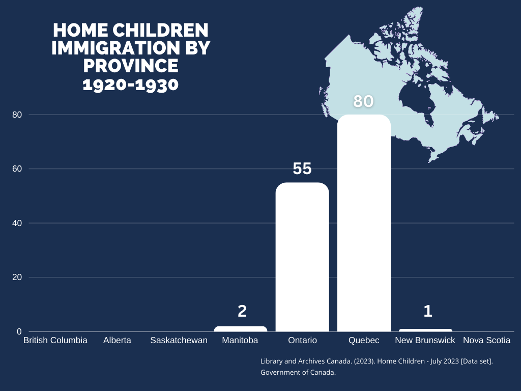
Although more than 100,000 Home Children came to Canada in the six decades covered by the data, we were only able to refine approximately 9,000 entries. This was predominantly due to lack of destination data; many columns were simply marked as “null”. Nonetheless, the sample size covered the entire period and might be extrapolated as representational of the larger group.
Map Trial
Karim worked hard over several weeks to try and transfer the cleaned data to a Google map, persevering through a number of frustrating challenges. Below is one of his early attempts at showcasing the immigration data for the 1870s. We had hoped to create a new colour-coded layer for each decade in order to uncover any trends in destination over the course of each decade. Unfortunately, only 50 data points for each decade could be plotted per map layer, and so Google maps could not be used. Professor Crompton assessed several other mapping tools but none had the right combination of accessibility and customization that suited our group’s vision.
Transition to Graphing
After exhausting the available options to represent the data on a map, our group transitioned to graphing. Although an interactive map would have increased the viewer’s connection to time and place and allowed a closer inspection of specific towns, the representation of the data as a graph does allow some analysis of rates and destinations. Future projects could migrate the data set to more advanced mapping tools and perhaps capture more of our aspirational representations.
Here is an early attempt at graphing the data. The various overlaps in years and even province names created data variations that we had to resolve.
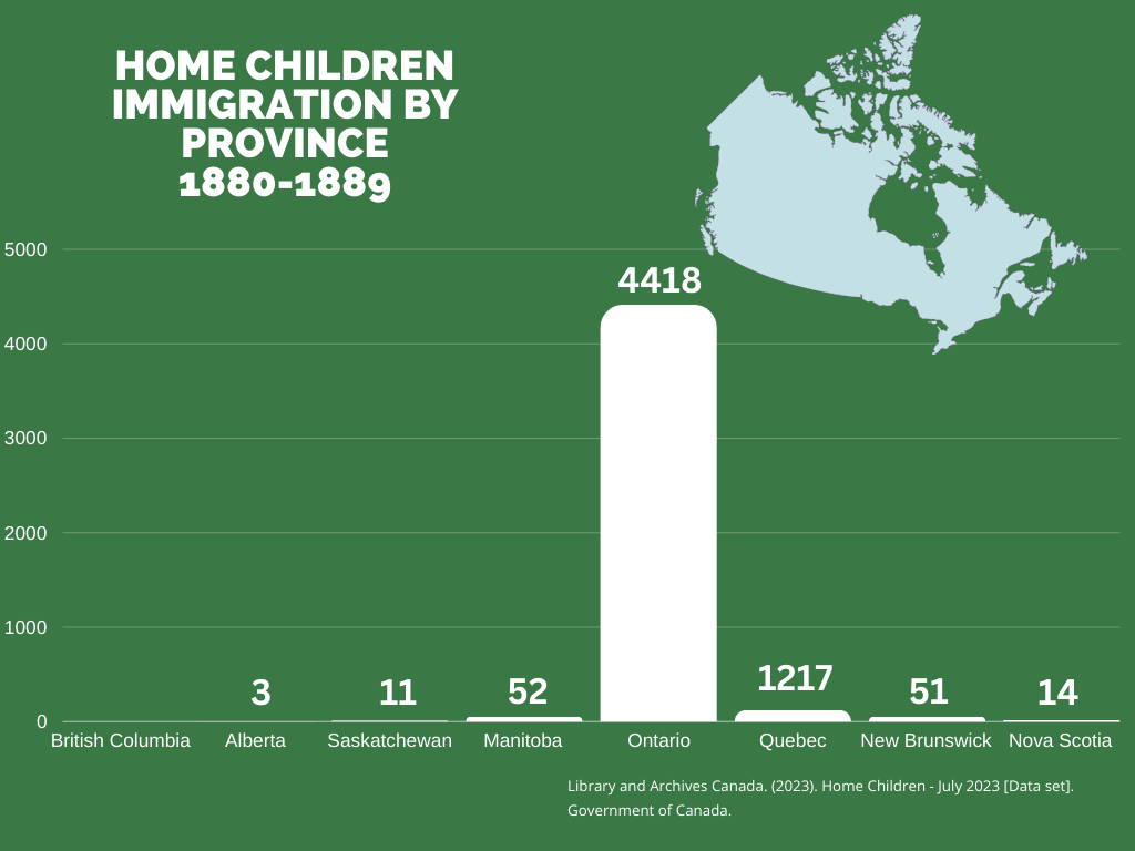
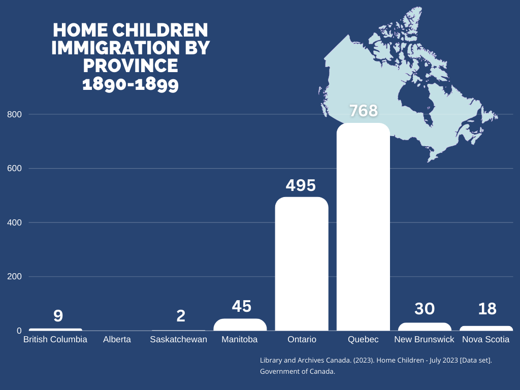
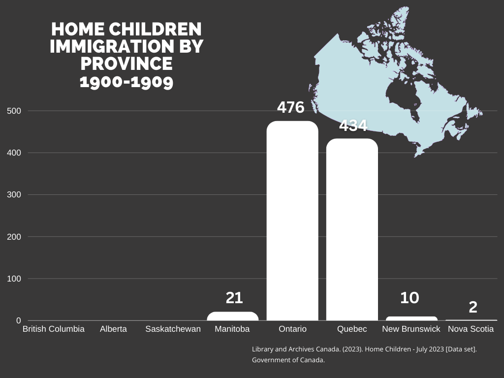
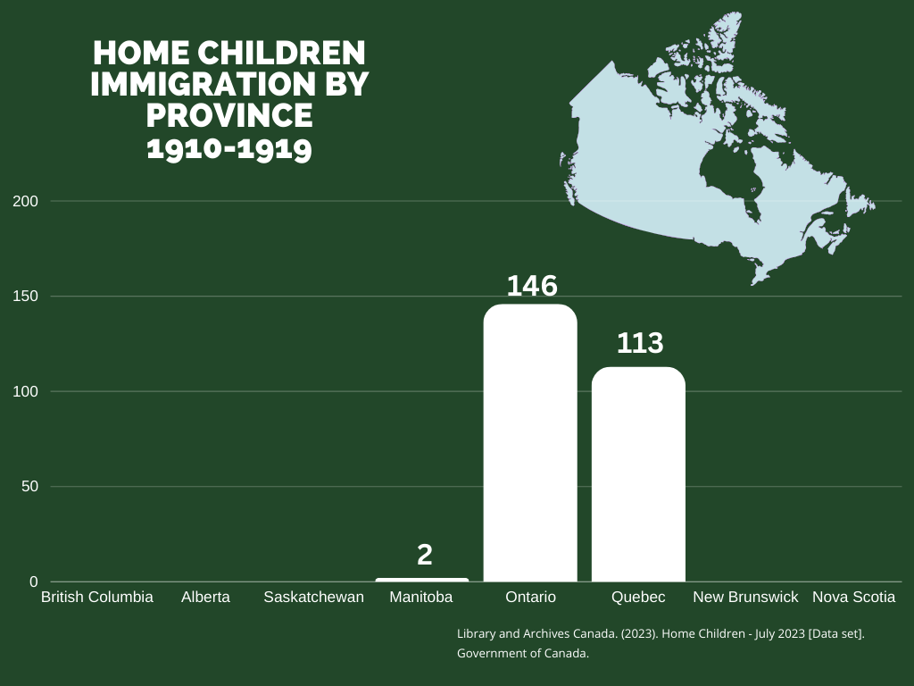
The presentation of the graph was cleaned and improved by Eileen. This included removal of some extraneous data, such as the small number of USA destination addresses, the combination of data into single provinces, and the creation of the below graphics. You can explore the immigration by decade and as an aggregate. Eileen also created the web page and created or acquired the graphics.


Interpretation of Process and Results
We had hoped that our mapping or graphing would result in new knowledge showing how immigration patterns shifted during the roughly six decades that the Home Children schemes were operational. Unfortunately, the small subset of data that we were able to use, combined with the required reversion to graphing instead of mapping meant that little new knowledge was created. We can observe that the peak of the immigrations represented by our data was in the periods between 1880 and 1900, and that the majority of the children were sent to Ontario and Quebec. We are unable to discern if immigration patterns spread outward from urban centers over the decades, or if transportation systems had any effect. From this perspective, our project was unsuccessful.
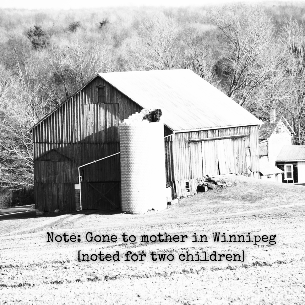
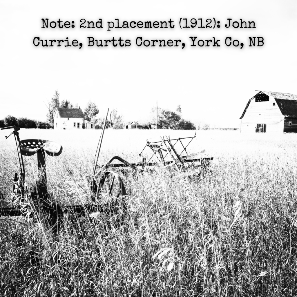
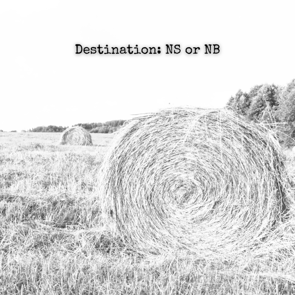
However, in the process of becoming familiar with the data we also become more familiar with the people that it represented. This is best highlighted by Alex’s selection of Varia, below. The Home Children were real children who cannot be accurately represented by data or understood through graphs. The hints of the distinct individuals that are found within these data sets have affected us a century later. This can be interpreted as a project success.
Varia
We encountered a lot of interesting information as we worked through the data. Since we were interested in rehumanizing the data, we collected some of these tidbits to share. Some hint at sadness, others mysteries, and some suggest the happiness of family reunions. Alex nicknamed these his “stand-outs”.


Additional Media Resources
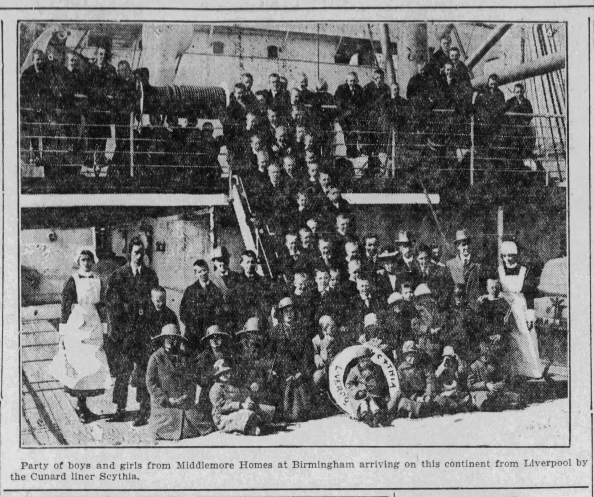
The newspapers of the era often documented the arrival of the Home Children, with mixed sentiments. These related to our project because they talk about the immigration of individual children to Canada and the destinations that some of them reached. Click each article to view a larger version.

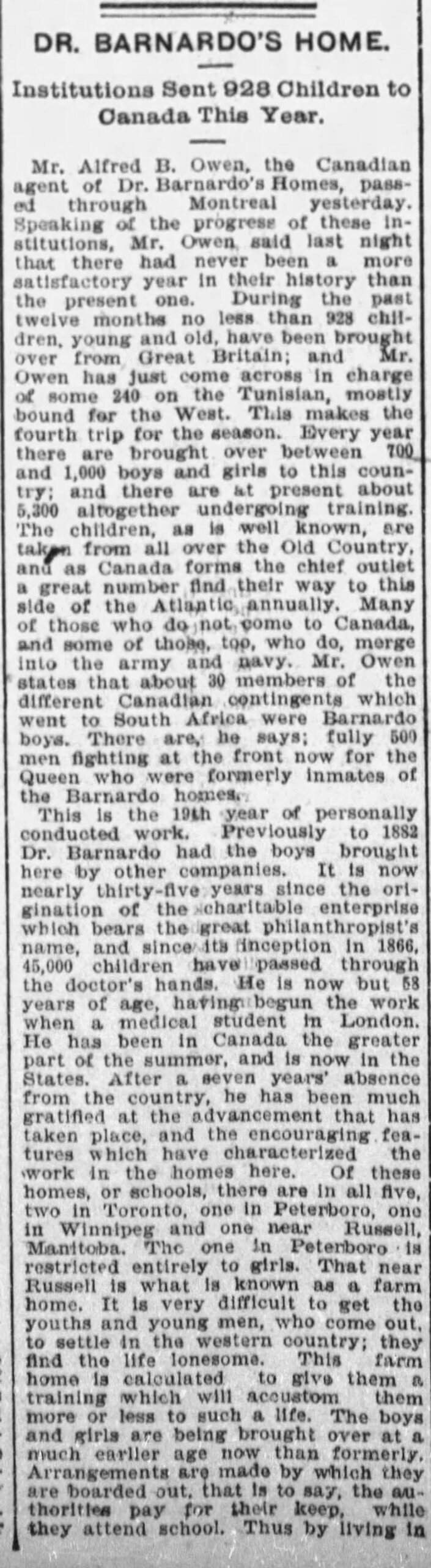
The Ottawa Citizen
Monday, July 12, 1909
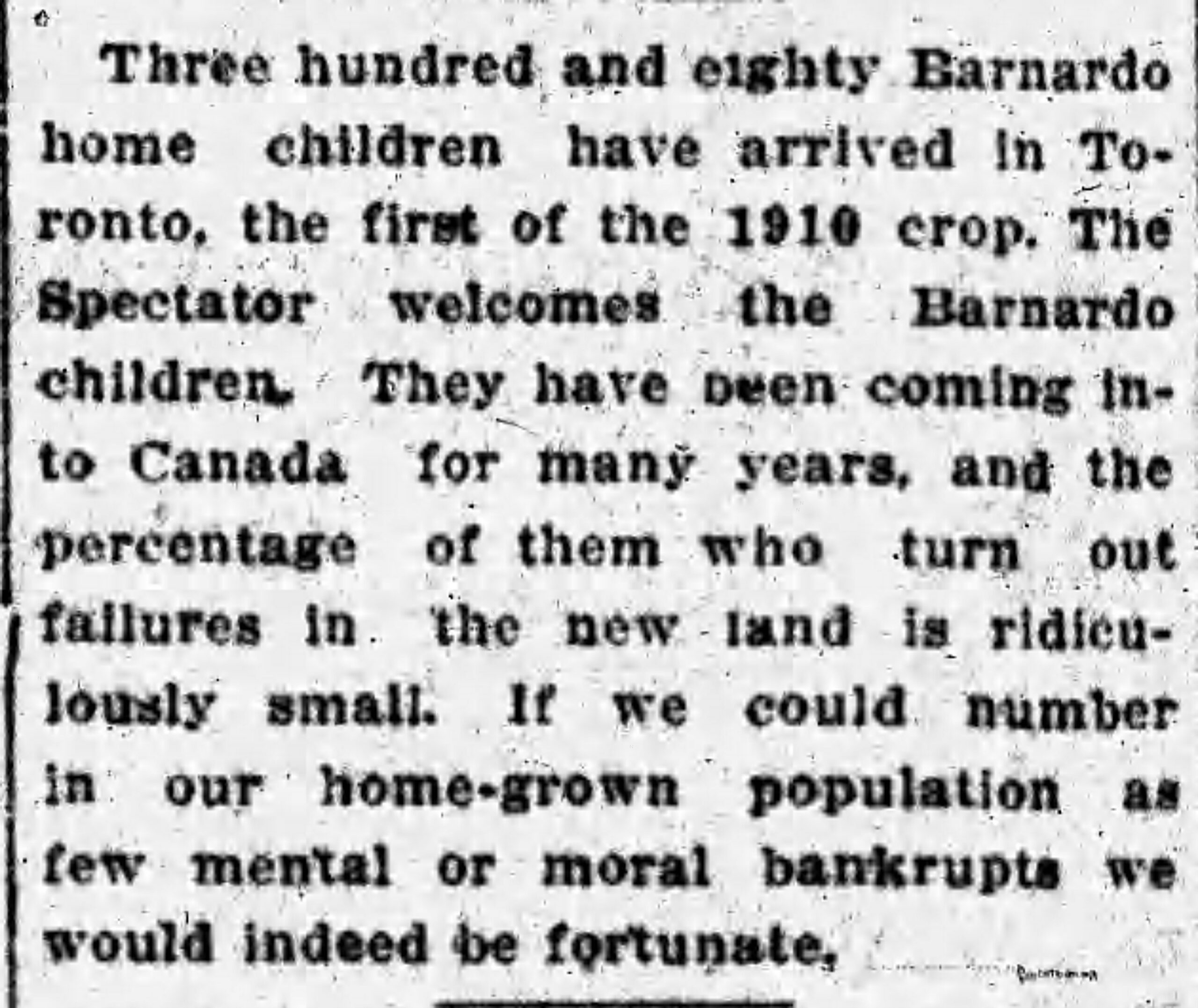
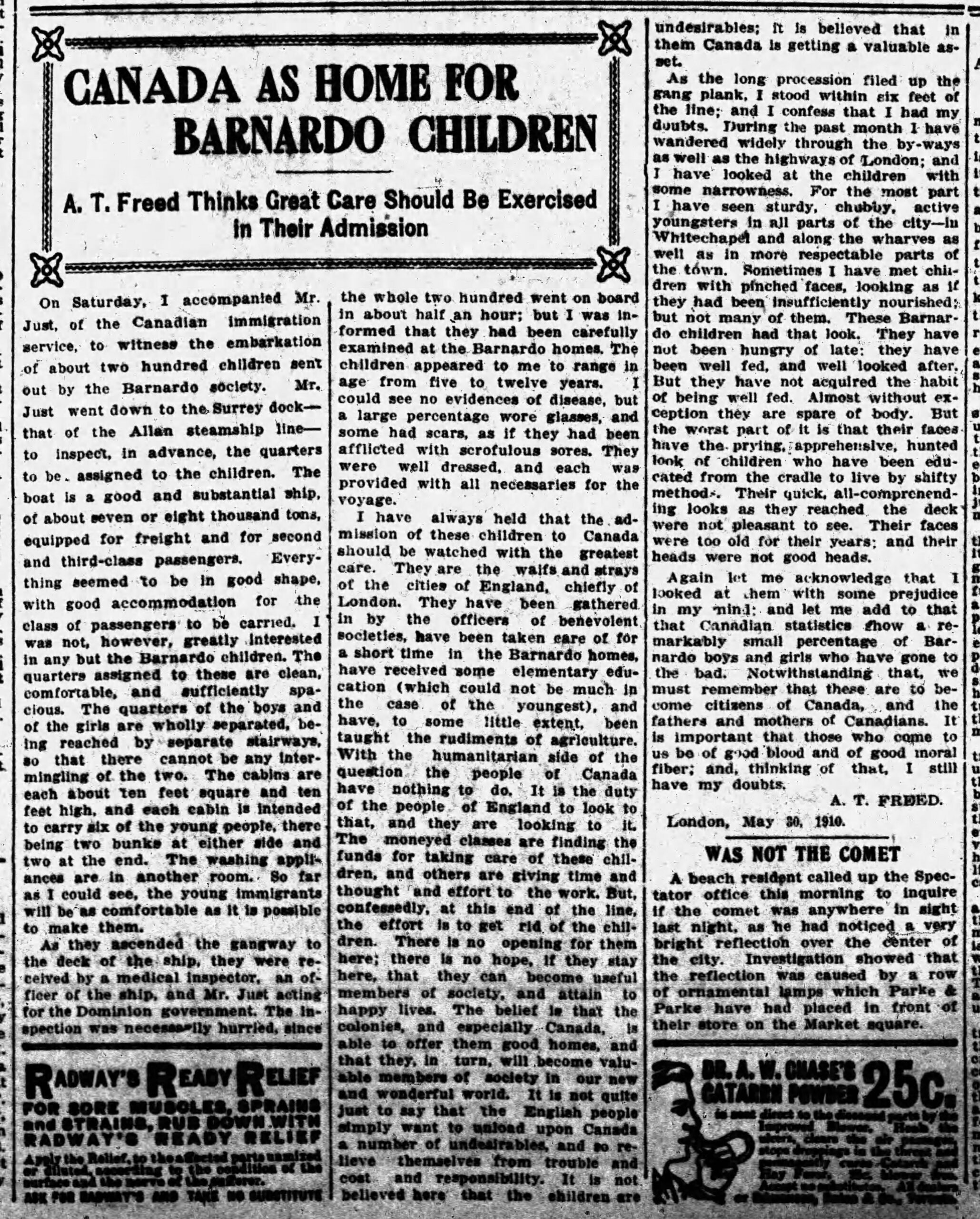
The Hamilton Spectator
Tuesday, March 22, 1910

Group of boys working in a field at the Philanthropic Society Farm School, c1898-1910. Via LAC, CC licence.

Mon, Apr 19, 1920, The Toronto Star


The Gazette, Montreal, Quebec,
Monday, October 15, 1900
The Victoria Daily Times
Wednesday, June 27, 1923
Citations
Johnson, Morgan Brie. “Settler Colonial Structures of Domestication: British Home Children in Canada.” Genealogy (Basel), vol. 5, no. 3, 2021, pp. 78-, https://doi.org/10.3390/genealogy5030078.
Library and Archives Canada. (2023). Home Children – July 2023 [Data set]. Government of Canada.